
Voyage Vista
Travel planning app
Voyage Vista is a travel app focused on helping people plan trips and vacations. The app needed a design for a Daily Travel Planner, which also provided an opportunity to refresh its visual identity.
To address the complexity of trip logistics, I designed a simple, intuitive planner that transforms user data into editable daily schedules. The refreshed experience integrates localized insights directly into the itinerary, ensuring users spend less time managing their schedule and more time exploring their destination.
I developed the new visual concept for the Voyage Vista identity, style tiles, and Daily Trip Planner, and was fully responsible for the entire design process, including user research, overall brand direction, user flows, and final interface design.
Background
Voyage Vista, despite its useful features, lacked a user-friendly itinerary-creation experience. Users felt confused when planning their trips, managing their itineraries, and even finding. Additionally, the app's visual design needed to be more minimal and specific to this user.
My goal at this stage was to understand the users' pain points and the competitive landscape, without yet entering the solution design phase.
Users & Audience
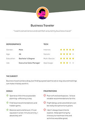
This project was focused on three primary personas provided at the start of the project: an Adventurous Explorer, a Family Traveler, and a Business Traveler. Though each had different needs and behaviors, I chose the Explorer persona as the primary focus because this group is more interested in discovering new destinations and other experiences. The app's visual design and structure could have the most significant impact on them. At the same time, the design decisions would have to be flexible enough to cover the needs of families and business travelers.


Archetype Moodboards
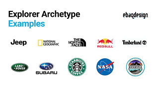
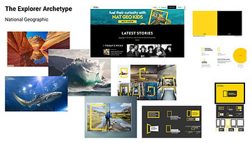
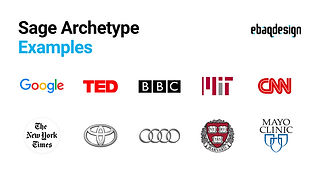
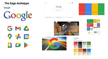
I began by creating moodboards for the brand archetypes that best reflected the key user persona.
I used the archetypes of the Explorer and the Sage to convey the joy of discovery and mastery in the app. I decided to keep the design simple, clear, and uncluttered so that users could quickly create their own itinerary without feeling pressured or complicated.


.jpg)

.jpg)
Development & Design
Brand Moodboards
To shape the brand's feel, I created several moodboards that represented a visual space of travel, nature, adventure, and real-life experiences. My goal was to first define the project's overall feel before diving into the UI design. The selected images helped guide the project's colors, typography, and visual style in a specific direction.

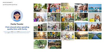
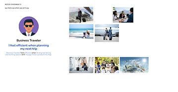
In the design process, I tried to strike a balance between a sense of adventure and trust, while also considering order and flexibility
Card Sorting & Site Mapping
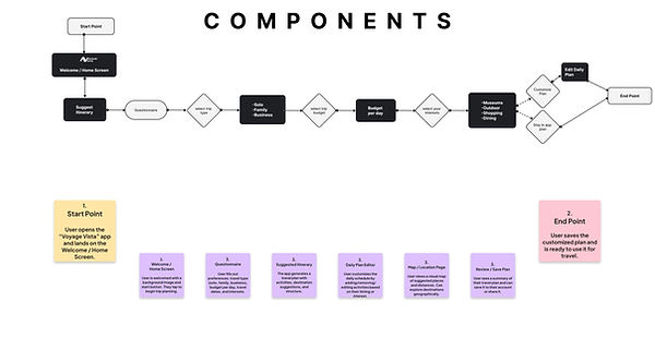
During the Development phase of the Voyage Vista project, my primary focus was on translating the initial ideas into the actual UI structure. After receiving and determining the design direction, I first attempted to define the user journey through the application by creating a User Flow and Components structure. This phase helped to clearly define the decision points and sequence of user interactions in the travel experience.
Content Mapping

Card Sorting

To better understand how users move through the app, I created a User Flow that maps the key steps from start to finish for completing a trip plan. This helped me visualize the user journey and identify important decision points and interactions.
By defining this flow, I ensured the app's structure supports a smooth, intuitive experience, reducing confusion and guiding users clearly toward their goals.
User Flow
Final Designs
During the final design phase, my focus was on creating a cohesive visual language for the Voyage Vista brand, one that felt both adventurous and relaxed and trustworthy to the user. My goal with this tile style wasn’t just to choose colors and fonts, but also to shape the brand's emotional mood so that users would experience a sense of discovery and enjoyment of the journey when they looked at the interface.
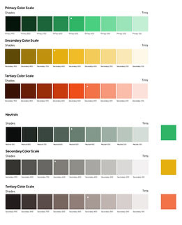
Color
I wanted the colors to feel calm but still a little energetic.
The greens connect to nature and exploration, while warm gold highlights key moments. A touch of orange adds warmth and personality.
Neutrals help keep everything clean and easy to read.
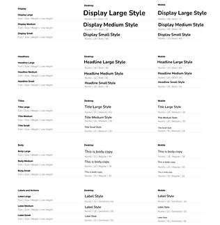
Typography
I chose a simple, friendly typeface using Nunito.
The rounded shapes make the interface feel approachable, while the clear hierarchy helps guide users through the content easily.
I used bold styles for emphasis and lighter weights for readability, keeping everything clean and balanced.

Imagery
I selected imagery that reflects a mix of discovery, comfort, and real-life travel moments.
From quiet architecture and natural landscapes to social and family experiences, the images help create a sense of exploration while still feeling warm and relatable.

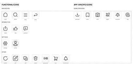
Icons
For the icons, I intentionally chose simple, friendly forms. I wanted the icons to be functional and convey a sense of fun and playfulness, as if the user is discovering a light, comfortable experience. The soft corners and clean lines make the icons approachable while also aiding in quick navigation.
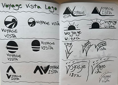
Logo
I designed the logo to reflect a sense of movement and exploration.
The angled form suggests direction and travel, while the color variations help the brand stay flexible across different contexts.
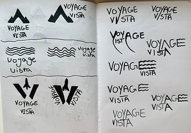

Overall, the tile style forms the foundation of Voyage Vista’s visual identity, and I balanced visual beauty, readability, and the brand's emotional feel.

Key Insights During This Phase
At this stage of designing Voyage Vista, my focus was on refining the page structure and visual decisions to make the user experience more straightforward. One thing that became clear during the process was that when key elements like the menu, icons, and content sections have clear, consistent places, the entire page feels more organized. The user can easily follow their path. For this reason, I kept the layouts simple and avoided visual clutter.
One of the critical decisions for me was that the icons should not just be decorative but actually help explain the functions. Therefore, I kept the icons' design playful and straightforward, so they convey a sense of travel and enjoyment and serve as clear navigation signs. This made the design feel less formal and more like a travel companion.
During the design development process, I realized that maintaining a balance between the brand's visual identity and the interface's readability was the main challenge. Some of the initial ideas were aesthetically appealing. However, when put together, they took the focus off the main user experience. So, I simplified some of the details to keep the overall structure clearer.
One limitation of this phase was that not all pages or interactions were fully developed, and the focus was primarily on the visual language and basic structure. This meant that some details, such as different interaction modes or more complex scenarios, were still conceptual and needed further development.
Wireframes
Sketches Wireframes
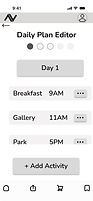
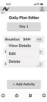
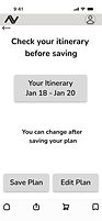
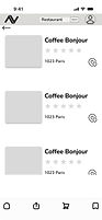
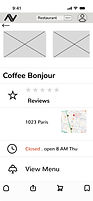
After I had the structure in place step by step, I did wireframing, quickly testing different layouts with low-resolution prototypes. The goal of this step was to explore the placement of key elements like images, text, and buttons to determine the best visual and functional mix before finalizing the design.
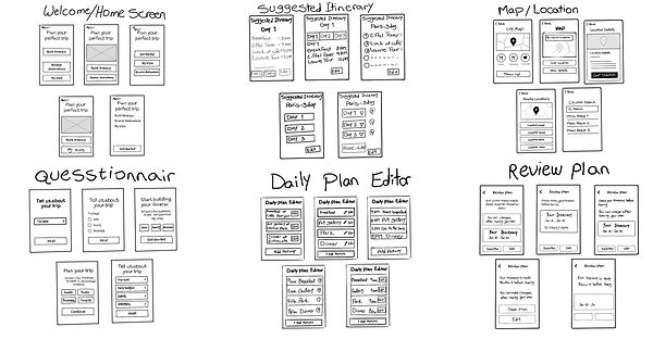
Low-Fidelity Wireframes
I began with simple wireframes to figure out the structure and flow. This helped me focus on how everything connects before getting into the visual design.


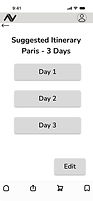
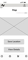
High-Fidelity Wireframes
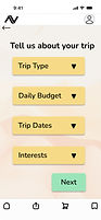
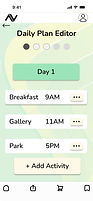
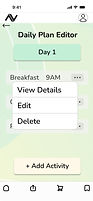
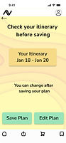
These high-fidelity screens bring the final experience to life by combining structure, content, and visual design into a clear, cohesive user journey.





Next Steps
As a next step for the Voyage Vista project, I plan to conduct usability testing to better reflect the real-world experience. I want to make the experience more natural and closer to how a real trip would be scheduled. I want to test the navigation flow, destination selection, and itinerary creation with real users to understand where things are clear and where they might be confusing. In addition to refining the details, I want to work on the pages I haven't built yet.
Final Thoughts
From a branding and business perspective, my goal with Voyage Vista has always been to create something reliable, pleasant, and easy to use. I designed it as a supportive travel companion, not just another planning app. The consistent colors, friendly tone, and playful icons were deliberate choices to help make the experience warm and enjoyable, not overwhelming.
One of the biggest things I learned from designing Voyage Vista is that good design is less about making something look perfect and more about finding the right balance between emotion, clarity, and structure. By conducting real user testing, I can identify the app's real problems and make improvements. Working on this project helped me slow down and think more carefully about why I made the design choices I made. This mindset will stay with me on future projects.