
StepChef
Recipe App
When I started looking at cooking apps, it became clear that many weren’t designed for beginners. It was as if they assumed the user already knew a few things; if they didn’t, it was easy to get confused or not know what to do next.
This made me think that if I were to design an app, it would have to be much simpler and easier to understand. It was important to me that the user didn’t feel pressured or that they were making mistakes. I wanted it to be an experience that would guide them step by step and help them move forward without stress, especially when they were making a dish for the first time.
During this project, I first tried to understand where exactly this group of users was having trouble. Then I started sketching and testing different ideas to see which was clearest. After that, I tested it with a few people and used their feedback to refine the design a bit and make it more logical.
Background Research
At this stage, I tried to better understand the problems users, especially those new to cooking, face when using cooking apps. To do this, I paid attention to survey results, user feedback, and reviews of several similar apps so that my decisions were not based only on guesswork.
Competitive Review
To better understand this area, I reviewed several popular recipe apps to see how they present information to the user and what might be challenging for novices.
Apps reviewed

Tasty app

Yammly app

SideChef app
In reviewing apps like Tasty, Yummly, and SideChef, it became clear that each one takes a different approach. Some apps, like Tasty, focus more on videos and quick, step-by-step instructions, which appeal to novice users. In contrast, apps like Yummly offer many features, such as filters, meal planning, and shopping lists. However, they can seem a bit complicated for a novice user. SideChef tries to create a simpler experience by providing step-by-step instructions.
Insights
A few important points emerged from reviewing these apps. First, step-by-step instructions and the use of video or images can be very helpful for novice users. Second, having too many features can be confusing if they are not properly organized. Finally, simple navigation and clear directions have a big impact on the user experience.
How this informed my design
These reviews helped me focus more on simplicity, clarity of steps, and reduction of complexity in the design of StepChef. I also used a step-by-step presentation and an understandable structure to make the experience easier for novice users.
Reference Articles & User Interviews
While working on this project, I also examined general patterns in how people use recipe apps. I noticed that different types of users approach cooking in very different ways.
For example, beginners often prefer step-by-step instructions with visuals, so they don’t feel lost during the process. They tend to rely on simple guidance and clear steps rather than exploring too many features.
Another thing I noticed was that not everyone uses these apps the same way. Some people want to find something quick and cook without thinking too much, especially when they’re busy. But others take more time and actually like planning their meals or keeping track of what they have.
Seeing this difference made me realize that trying to design for everyone in the same way doesn’t really work. For beginners, especially, things need to feel simple and not overwhelming.
What Users Say They Want
From what I've observed, users mainly want things to feel simple and clear when using a recipe app. Beginners especially don’t want to feel confused or overwhelmed while cooking. They prefer step-by-step instructions that are easy to follow, with visuals that help them understand what to do next.
Many users also want to save time, so quick recipes and simple steps are important. At the same time, some users like having options like meal planning or ingredient organization, but only if those features are easy to use. Overall, users value clarity, simplicity, and a sense of control while cooking.
User Behaviors & Pain Points
While looking at how people use recipe apps, I noticed a few patterns in their behavior. Beginners usually move step by step and need clear guidance. At the same time, more experienced users tend to skip around and look for specific information quickly.
One common issue is that users can feel overwhelmed when there are too many options or too much information on the screen. It can be hard to know where to start, especially for someone new to cooking.
Another challenge is keeping track of ingredients and steps simultaneously. Users often have to scroll back and forth, which can interrupt the cooking process.
These behaviors and pain points showed me that the design needs to stay simple, focused, and easy to follow, especially for beginners.
User Needs
While working on this project, I realized that beginner users like Bella often feel lost when using recipe apps. There are usually too many options, and the steps are not always clear, especially for someone who is just starting.
Instead of feeling supported, they can feel confused or unsure about what to do next.
Because of this, I saw the need for a simpler and more guided experience that helps users move step by step and feel more confident while cooking.
Persona Prioritization
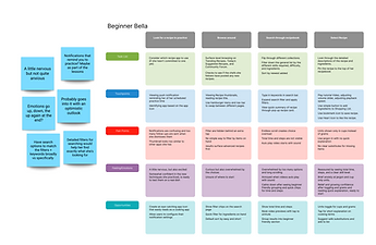
For this project, I decided to focus on Beginner Bella because I kept noticing the same pattern in how new users interact with recipe apps.
People who are just starting to cook don’t really explore features the way more experienced users do. They mostly want to understand what to do next without feeling lost or overwhelmed. Even small things like unclear steps or too many options can make the experience frustrating.
While working through my ideas, I kept coming back to Bella’s situation. It made more sense to design around someone who needs guidance and clarity, rather than someone who is already confident.
That’s why I chose her as my main persona and focused on creating something that feels simple, supportive, and easy to follow.
Defining User Needs
Based on Bella’s journey, several key needs became clear. She needs a simple and guided experience that helps her understand what to do at each step.
Bella benefits from step-by-step instructions supported by visuals such as photos or short videos. She also needs clear ingredient information, including substitutions and easy-to-understand measurements.
Too many options or complex layouts can overwhelm her, so reducing clutter and simplifying choices is important. In addition, features such as reminders, a clear total time display, and supportive feedback help her feel more confident while cooking.
Object Mapping
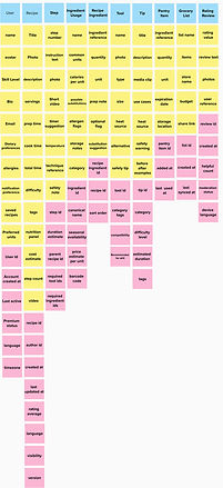
To better understand how the system should support Bella’s needs, I created an object map that defines the main components of the StepChef app.
This includes key elements such as users, recipes, steps, ingredients, tools, grocery lists, and tips, along with how they relate to one another. This structure helped ensure that the design supports both the cooking process and the user’s interactions in a clear and organized way.
CTA Matrix
I developed a CTA matrix to connect Bella’s needs with the specific actions she would take in the app. This helped me clearly define what users should be able to do at each step of the experience, including finding recipes, following instructions, adjusting ingredient amounts, and managing grocery lists. By mapping these actions, I ensured that every part of the interface supports the user’s goals and reduces confusion during the cooking process.

Problem Statement
While working on this project, I realized that beginner users like Bella often feel overwhelmed when using recipe apps.
Many apps include too many options, unclear steps, and features that assume prior experience. As a result, users can feel confused or unsure about what to do next, rather than feeling supported. There is a clear need for a simpler and more guided experience that helps beginner users follow recipes step by step, understand the process, and feel more confident while cooking.
Reverse Journey Mapping
The Artifact
To define the app's core experience, I created an artifact based on a real recipe.
This artifact represents the main interaction point where the user actively cooks. It includes ingredients and step-by-step instructions that guide the user through the process.
For a beginner like Bella, this structure is essential because it breaks the recipe into clear and manageable steps. It reduces confusion and helps her feel more confident while cooking.
This artifact helped me understand what information needs to be included and how the experience should be organized in a way that feels simple and clear for beginner users.
.jpg)
%202.jpg)
Reverse Engineering the Journey (The Backwards Journey Map)
To better understand how the final design supports Beginner Bella, I analyzed the journey by working backward from the completed recipe experience.
Starting from the end goal, I identified the key steps Bella takes to complete a recipe successfully and how each stage supports her confidence and learning.
End Goal: Bella completes the recipe and feels confident in her cooking.
Step 4: Serving the dish
-
Bella finishes the recipe and feels a sense of accomplishment.
Step 3: Cooking and combining ingredients
-
She follows clear step-by-step instructions and understands how ingredients work together.
Step 2: Preparing ingredients
-
Bella gathers and prepares ingredients with simple guidance.
Step 1: Understanding what to do
-
She reads clear instructions and uses visual cues to begin with confidence.
This reverse mapping helped ensure that each part of the experience is designed to guide and support beginner users.
Pain Points
When I looked more closely at Bella’s experience through the reverse journey, a few challenges stood out to me.
One of the main issues is that she can easily feel overwhelmed when too many steps or choices are presented at once. Instead of feeling guided, she may feel unsure about where to start.
Another problem is that without clear direction, it becomes difficult for her to know what to do next. This hesitation can interrupt her flow while cooking.
I also noticed that complicated instructions or unfamiliar cooking terms can lower her confidence, especially since she is still learning.
In addition, switching back and forth between ingredients and instructions can be distracting and make the process feel harder than it should be.
Overall, these observations showed me that the experience needs to stay simple, clear, and supportive so beginner users like Bella can move forward with confidence.
Explore Functions
To explore possible solutions, I created sketches to visualize how beginner users like Bella might interact with the app. These sketches helped me brainstorm features such as guided steps, ingredient tracking, timers, and supportive feedback throughout the cooking process.
Task & Function Ideation Sketches

Bella’s Cooking Journey

Guided Recipe Steps
Functions & Features List
At the same time, I started thinking about what could help users while they’re cooking. For example, things like a simple shopping list, substitutions, timers, or even small explanations when a term is confusing. I realized that beginners don’t just need steps—they need support along the way. Looking at all these ideas together helped me step back a bit and decide which features would matter most to Bella, rather than just adding more options.
Initial Feature Brainstorm (All Ideas)
-
Browse Categories & Tags
-
Budget Mode
-
Cooking Memory Scrapbook
-
Dish Projection Plate
-
Equipment Check-Up
-
Fridge Expiration Radar
-
Future-Self Mentor
-
Full Body Impact Tracker
-
Filters & Sort
-
Guided Step-by-Step Coach
-
Ingredient Mood Matcher
-
Jargon-Free Step Translator
-
Mistake-Recovery Tips
-
Mood-Based Kitchen Lighting
-
Pantry Staples Checklist
-
Quick Wins Filters
-
Recipe Detail Page
-
Ratings & Reviews
-
Recipe Import
-
Shopping List Builder
-
Step Timers
-
Smart Substitutions for Beginners
-
Save/Favorites & Custom Collections
-
Servings Scaler
-
Technique Primers
-
Universal Search
-
Units Toggle
-
Visual Doneness Gallery
Top 20 Prioritized Features
From this larger list, I selected the top features that would best support Bella as a beginner. I focused on simplicity, guidance, and reducing confusion during cooking.
1. Universal Search
2. Browse Categories
3. Filters & Sort
4. Recipe Detail Page
5. Shopping List Builder
6. Servings Scaler
7. Units Toggle
8. Step Timers
9. Ratings & Reviews
10. Save/Favorites & Custom Collections
11. Guided Step-by-Step
12. Quick Wins Filters
13. Technique Primers
14. Visual Doneness Gallery
15. Smart Substitutions
for Beginners
16. Pantry Staples Checklist
17. Budget Mode
18. Mistake-Recovery Tips
19. Equipment Check-Up
20. Recipe Import
Top 20 Prioritized Features
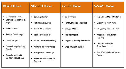
Once I had my list of features, I needed to decide what really mattered for the app's first version. I used a MoSCoW approach to help organize my thinking, but I was mainly focused on what would make things easier for Bella.
Because she's a beginner, I tried to prioritize features that feel simple and supportive, such as clear steps and guidance, rather than adding too many advanced options. I didn't want the app to feel overwhelming right from the start.
To better organize these features, I grouped them using a MoSCoW framework based on their importance for Bella’s first experience.
Design Development
Mapping inputs/outputs
To better understand how the system supports Bella during cooking, I mapped the key inputs and outputs of the StepChef app.

Bella provides inputs such as selecting ingredients she already has, choosing the number of servings, setting cooking timers, and requesting a guided step-by-step mode. These inputs allow the system to tailor the experience to her needs as a beginner.
In response, the app provides outputs such as personalized recipe suggestions, automatically adjusted ingredient quantities, cooking time notifications, and simplified instructions. It also provides feedback when she completes a recipe, helping her feel more confident and motivated.
This mapping helped me clearly see how each interaction reduces confusion and supports Bella step by step throughout the cooking experience.
Task Flow
To better understand how Bella would complete this task, I created a task flow for adding a recipe to the recipe book.
The process begins when she opens a recipe and decides she wants to save it. She taps the “Add to Recipe Book” button and confirms her choice.
I tried to keep this flow as simple as possible, so she doesn’t have to think too much or go through unnecessary steps. Since Bella is a beginner, making this action quick and clear helps her feel more comfortable using the app.
%20(2).png)
User Flow
While the task flow shows the overall process, the user flow focuses on how Bella interacts with the app step by step.
After opening a recipe, Bella taps “Add to Recipe Book,” then chooses a category such as breakfast, lunch, dinner, or favorites. If she selects a category, the recipe is saved there; otherwise, it is stored in a default folder. She then confirms the action and receives feedback that the recipe has been successfully added.
Designing this flow allowed me to think more carefully about decision points and flexibility, while keeping the experience simple and easy to follow for a beginner user.
%20(3).png)
UI Design Elements
When I started working on the UI, I kept thinking about Bella and what would make cooking easier for her. At first, I realized that too many options or complicated controls would probably make her feel overwhelmed. Instead of adding more, I tried to simplify things. I focused on the basics like a clear search bar, simple filters, and choices that feel obvious without extra thought.
I also paid attention to how the app reacts to her actions. Even small feedback, like confirming something was saved or showing progress, can make a big difference. It helps her feel more in control and less unsure about what’s happening.
For navigation, I didn’t want her to feel lost at any point. That’s why I kept it very familiar, with a bottom menu and clear sections. The goal was for her to always know where she was without having to stop and think.
I also used simple layouts like cards to keep everything organized. I didn’t want the screen to feel crowded or confusing.
In the end, my goal wasn’t to make something complex or impressive. I just wanted the app to feel calm, clear, and supportive so Bella can focus on cooking instead of figuring out how to use it.
UI Iconography
When I was thinking about the icons, I tried to keep things as simple and familiar as possible for Bella. Since she is a beginner, I didn’t want her to stop and think about what each icon means. So, I used common, recognizable icons she has probably seen before, like a heart for saving, a star for rating, and simple food or tool icons.
I also made sure the icons support the content rather than replace it. For example, they help her quickly scan the screen. However, she can still understand everything even without relying only on icons. The main goal was to reduce the need to read too much and make the app feel easier to navigate. If Bella can quickly recognize what to do just by looking, she feels more confident while using the app. Overall, I kept the icons clear, consistent, and predictable so they support the experience rather than complicate it.
Low-fi/Paper Prototypes
Sketches
At the beginning, I made rough sketches to get my ideas out quickly, without worrying too much about details.
I wasn’t trying to design something perfect at this stage. I just wanted to understand how Bella might move through the app and what she would need along the way.
I focused on simple flows, such as searching for a recipe, reviewing the details, and following step-by-step instructions. While sketching, I also started thinking about small support features, like timers or helpful tips, and how they could fit into the experience.
This stage helped me think more freely. It gave me space to try different ideas and see what made sense before deciding on a more structured direction.
Wireframes
After sketching my ideas, I started organizing the app screens more clearly by thinking through each page and its purpose.
I designed key screens, including the landing page, home page, search, recipe details, and the step-by-step cooking flow. For each screen, I focused on what the user needs at that moment and how to make the experience simple and easy to follow.
For example, the landing page is meant to welcome users and guide them into the app without confusion. The home page serves as a central hub where users can quickly explore recipes. The recipe page provides clear instructions, while the step-by-step screen supports users during cooking with guidance and timing.
Thinking through each screen’s purpose helped me create a more structured and user-friendly experience, especially for beginner users like Bella.


Low-fi Testing
App Name Survey
As part of the process, I explored different name options for the app. I wanted to understand which one would feel most clear and approachable to users.
I created a short survey and shared it with a small group of participants. Among the different options, StepChef received the strongest overall response.
Many participants mentioned that the name felt simple, easy to understand, and closely related to the idea of step-by-step cooking. It also felt trustworthy, which is important for beginner users.
This feedback helped me choose a name that is not only memorable but also clearly conveys the app's purpose.

Paper Prototyping
To test my ideas early, I created a paper prototype of the StepChef app using simple printed screens. My goal was to see how real users would move through the app before designing anything in detail.
I focused on key flows, including signing up, searching for a recipe, reviewing ingredients, and saving a recipe to the Recipe Book. These were based on the most important actions for a beginner user like Bella.
I conducted two usability testing sessions using the think-aloud method, in which participants shared their thoughts as they interacted with the prototype. This helped me understand where users felt confused, where they hesitated, and what felt easy or intuitive.
Testing with both a beginner user and a more experienced cook gave me useful insights into how users of different levels of experience interact with the app.
Overall, this process helped me identify areas that needed simplification, especially around navigation and understanding the next step. It also confirmed that keeping the flow clear and guided was important for building user confidence.


How the Test Was Administered
To evaluate the design, I conducted both usability testing sessions and a structured survey to gather user feedback from different perspectives.
Usability testing was conducted using a low-fidelity paper prototype of the StepChef app. I tested the design with two participants who had different levels of cooking experience. Each session followed a think-aloud approach, in which participants were encouraged to verbalize their thoughts as they completed tasks.
During the sessions, users were asked to complete three main tasks: signing up and finding a recipe, checking ingredients and using the shopping list, and saving a recipe for later use. I observed how they interacted with the interface, where they hesitated, and which actions felt unclear to them.
To support the testing process, I used printed prototype screens, a smartphone for recording, and prepared materials such as consent forms, pre-test questions, and post-test interviews. This helped ensure that the sessions were consistent and well-structured.
In addition to usability testing, I conducted a survey to explore user preferences regarding visual design decisions. The survey included questions about color palettes, layout styles, navigation structure, icon meaning, and interface terminology. This allowed me to compare different design options and understand what users felt more comfortable with.
By combining direct observation from usability testing with survey feedback, I gained a clearer understanding of user behavior and preferences, which supported more informed design decisions.


Refinement for full design & refined design Testing
Design Testing & Insights
To figure out which visual direction works best, I created a few design options and asked users to share their thoughts.
I showed several versions of the recipe screen with small changes in colors, button styles, and layout. I wanted to see which one felt more comfortable and easier to understand at first glance.
From their feedback, I realized that simpler designs worked better. When the layout felt too busy or the colors were too bold, the screen felt overwhelming.
Users also reacted more positively when the main actions, like “Go to Step by Step,” were clear and easy to notice without searching.
This helped me move toward a cleaner, more balanced design, focusing on clarity and a calmer visual feel so the app supports the user rather than distracting them.
Color + Visual Direction Exploration
To explore the visual direction, I tested a few color variations of the recipe screen. I wanted to see which one feels more comfortable and easier for users to understand immediately.

I also tested different image shapes to see which one feels more visually comfortable for users.

I tested different navigation and icon arrangements to see which layout feels more intuitive and easier for users to navigate.

Result & Insights
From the results, I noticed that users were more comfortable with designs that felt simple and clean.
Softer color palettes were chosen more often, and layouts with clear structure made navigation easier. Buttons that were easy to see and familiar icon placement also helped users move through the app more confidently.
Overall, this feedback helped me move toward a design that feels calmer, clearer, and easier to use.
Next Steps
Based on these findings, my next step is to refine the selected design direction and apply it consistently across all screens.
I plan to develop a higher-fidelity prototype and run another round of usability testing to validate these improvements and ensure the experience is clear, simple, and user-friendly.