
InnerBalance
Psychology App
Project Overview
Many users are interested in psychology, self-knowledge, and personal growth, but struggle to find reliable, well-structured information online. Existing platforms often present content in a fragmented way, leading to confusion and time-consuming navigation.
The goal of this project was to understand user behavior and design a platform (InnerBalance) that organizes content clearly, making it easier for users to find relevant resources quickly and efficiently, creating a clear, calm, and user-friendly experience where users can easily explore courses, articles, and self-growth materials without confusion.
My role included conducting user research, defining the platform's structure, and designing wireframes and visual layouts to improve usability.
Competitive Analysis
To better understand existing solutions in the psychology and self-growth space, I analyzed apps such as Headspace and Mindvalley. These platforms helped me observe how content is structured, how users discover programs, and how engagement is encouraged.
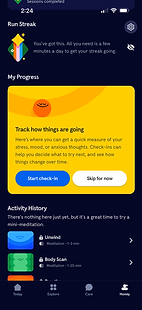
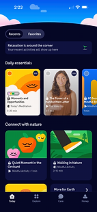
Headspace App
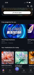
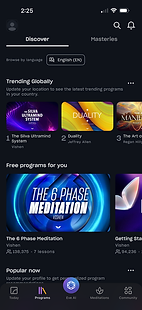
Mindvalley App
From this analysis, I noticed that:
-
Content is often grouped into categories, but navigation can still feel overwhelming.
-
Many options are presented at once, which may confuse users.
-
Some platforms focus more on visual appeal than clear structure.
-
Personalized recommendations help users stay engaged.
These insights guided my design decisions to create a simpler, more organized, and user-friendly experience.
My goal was to design a more focused psychology-based platform that reduces confusion and helps users find content more easily.
Users & Persona
Users & Audience
The primary users of this platform are individuals interested in self-development, psychology, and mental health improvement. These users often have limited time and need quick access to reliable and structured resources.
Persona: Leila
Leila is a 30-year-old professional who is interested in personal growth. She frequently searches for online courses and articles but often feels overwhelmed by unstructured content and confusing navigation.
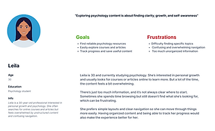
Empathy Map
To better understand user behavior, I created an empathy map based on Leila’s experience. This helped identify her frustrations, needs, and expectations when interacting with similar platforms

User Journey
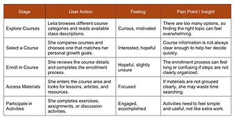
I mapped the user journey to understand how users interact with existing platforms and where they experience challenges.
Users typically start by searching for content, then browse different websites, and finally try to find relevant resources. During this process, they often face issues such as confusing navigation, poor categorization, and information overload.
Development
Initial Development
After analyzing user needs and reviewing existing platforms, I moved into the development phase to create a clearer and more structured experience.
Many platforms present self-growth content in a fragmented way, which can make navigation confusing and time-consuming. To address this issue, I focused on organizing content into clear categories and simplifying how users access information.
I began by thinking about how users like Leila search for content and what structure would help them find relevant resources more easily. I grouped similar topics—such as courses, articles, and learning materials—into logical sections to reduce cognitive overload.
My goal at this stage was to build a simple, intuitive foundation that allows users to quickly understand where they are and how to move through the platform without confusion.
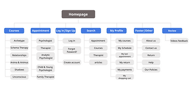
Site Structure
I organized the platform into five main sections:
-
Courses
-
Appointments
-
Search
-
Profile
-
Support
This structure helped create a clear hierarchy and ensured that users could easily navigate between different parts of the platform.
Wireframing
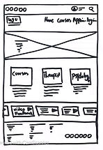
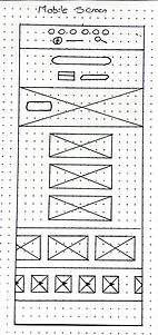
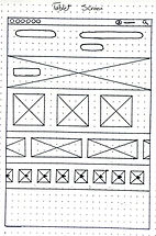
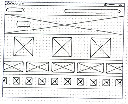
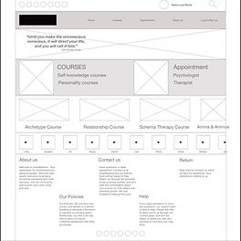
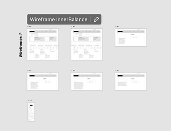
After defining the structure, I created low-fidelity wireframes to explore layout, navigation flow, and content hierarchy.
At this stage, I focused on simplicity and clarity. I sketched key screens, including the homepage, course listings, and content pages, to understand how users would move through the platform.
Special attention was given to spacing, grouping, and visual hierarchy to make sure the interface would not feel overwhelming. This step allowed me to test ideas quickly and refine the structure before adding visual details.

Initial Designs
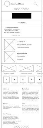
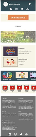
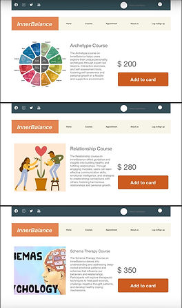
After wireframing, I moved into early visual designs for both desktop and mobile.
I focused on creating a calm and clean interface that reflects the purpose of a psychology-based platform. I used simple layouts, soft colors, and clear typography to improve readability and reduce visual noise.
Visual hierarchy was carefully applied to guide users’ attention and help them easily scan content. These designs established the overall look and feel of the platform and ensured consistency across different screen sizes.

Final Design
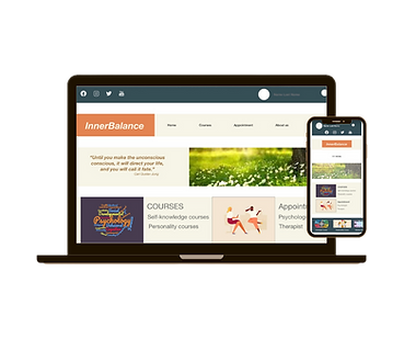
The final design brings together structure, usability, and visual clarity into a cohesive experience.
The interface was designed to reduce confusion and support users in exploring self-growth content in a calm and focused way. Clear navigation, well-organized categories, and consistent visual hierarchy help users quickly find relevant resources.
This final solution improves the overall user experience by reducing information overload, simplifying decision-making, and creating a more supportive and engaging environment for personal growth.
_.png)
Conclusion
This project helped me better understand how important clear structure and simplicity are in designing for users interested in self-growth and psychology. I realized that when content is not well organized, users can easily feel overwhelmed and lose motivation to continue exploring.
Through this process, I learned how to design with more intention—focusing on clarity, visual hierarchy, and reducing unnecessary complexity. My goal was to create a calm and supportive experience, and this project helped me take an important step toward that.
If I continue this project, my next step would be to test the design with real users to see where they feel confused or need guidance. Based on their feedback, I would refine the structure and improve the overall usability to make the experience even more intuitive and helpful.