
Smarter, Stress-free Time-tracking for Freelancers
Freelancer Time Tracking & Billing App
Smarter, Stress-free Time-tracking for Freelancers
Freelancer Time Tracking & Billing App
Freelancers often struggle to manage time across multiple projects, which can lead to stress and billing errors. This project explores a simple and reliable solution for tracking time and improving confidence in recorded work hours.
Backgroud
Problem & Context
While working on this project, I quickly realized that time management for freelancers is more complex than it first appears. When multiple projects are happening at the same time, it becomes easy to lose track of time while focusing on the work itself.
For example, it’s common to start working on a task and forget to start the timer. In other cases, work gets interrupted, and end times or breaks are not recorded properly. As a result, time entries often become incomplete, making it difficult to review total working hours accurately at the end of the day or week.
This issue is not just about tracking time—it also creates constant mental pressure. Since recorded hours directly affect a freelancer’s income, there is always an underlying concern about whether time is being tracked correctly.
In addition, creating invoices becomes another challenge. When the recorded data is unclear or unreliable, generating invoices takes more time and can add unnecessary stress to the overall workflow.
User & Audience
In this project, I focused on freelancers who work with multiple clients simultaneously and constantly switch between tasks. I noticed that because of this, it’s easy to lose track of time without realizing it.
I wanted to understand how they actually manage their day, what makes time tracking difficult for them, and what they really need from a tool. My goal was to design something simple that fits into their workflow rather than making things more complicated.
Persona
Juggler Jane is a freelance UX designer who works with multiple clients simultaneously. Her day is filled with constant task-switching, tight deadlines, and shifting priorities.
Because of this fast-paced workflow, she sometimes forgets to start or stop tracking her time—especially when she is deeply focused. Over time, these small gaps create inconsistencies in her records, making it stressful to review hours or generate invoices.
Jane needs a time-tracking experience that feels simple, reliable, and unobtrusive. She prefers tools that support her workflow naturally, allowing her to stay focused while still feeling confident in her recorded time.

Feature Prioritization
At this stage, I want to really understand what matters to freelancers when they track their time. Having too many features can make things more confusing, not better. So instead of trying to include everything, I focused on the essentials.
This helped me decide what really needs to be in the app's first version and what can wait. My goal was to keep the experience simple, clear, and genuinely helpful for everyday use.
Object Mapping
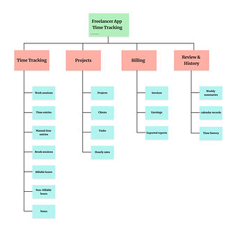
I started by mapping the app's main components and how they relate to each other. This helped me better understand the system's structure and organize key features into clear groups, such as time tracking, projects, billing, and history.
MoSCoW Analysis
To decide which features to focus on, I used the MoSCoW method. This helped me separate essential features from those that could be added later. My goal was to keep the app focused and avoid unnecessary complexity in the first version.

CTA Matrix
I also explored how users would interact with key actions in the app. By mapping out primary and secondary actions, I made sure that important tasks like starting a timer or creating an invoice are easy to access and clearly prioritized.

This process helped me stay focused on solving the core problem instead of overloading the product with unnecessary features.
EXPLORATION SKETCHES
Here, I explored a few layout ideas for how users might sign in, track time, and move between projects. I moved things around to see what feels faster in practice. Some versions looked fine at first, but didn’t work as well when switching between tasks—they felt a bit slow or slightly confusing. Because of that, I focused on simplifying the layout and keeping the main actions easy to access.
Layout Exploration
At this stage, I explored different layout options for key features such as Quick Start Timer, Switch Projects, and Project Setup/Invoice.
Quick Start Timer — Layout Variations
For the Quick Start Timer, I tested variations including a large central timer, a minimal start button, a widget-style layout, and a progress ring to see which felt faster and easier to access.

Switch Projects — Interaction Patterns
For switching between projects, I experimented with gestures like swipes, as well as dropdowns, tabs, and bottom sheets, to understand how users can move between tasks without losing focus.

Project Setup & Invoice — Flow Exploration
In the project setup and invoicing flow, I tried both single-screen forms and step-by-step layouts, as well as different ways to present costs and time, and to offer export options such as PDF or print.

These explorations helped me compare how each layout affects clarity, speed, and the overall flow of the experience.
Key Insights
Looking back at the sketches, a few important patterns started to become clear.
Looking back at the sketches, a few important patterns started to become clear.
-
Clearly showing the active project is essential. Without strong visual feedback, users can easily track time on the wrong project.
-
Users need a fast and frictionless way to start tracking time. Simpler layouts with fewer steps felt more natural, especially when users are in a hurry.
-
Switching between projects should feel effortless. Interaction patterns like swipe or quick access controls reduce interruptions during task switching.
-
Breaking complex tasks into smaller steps can make the process easier to follow, especially when dealing with project setup and invoicing.
-
Layouts that included too much information in one screen became harder to use. Simpler structures improved clarity and reduced cognitive load.
These insights helped guide my next steps and informed the direction I took in developing more refined designs.
System Sketches
In this stage, I focused on three main features of the app: starting the timer quickly, switching between projects, and setting up a project for invoice creation.
Function 1 — Quick Start Timer
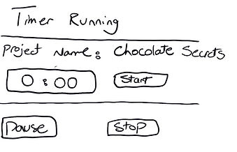
This feature helps users start tracking time quickly with only a few steps. I liked the versions where the timer is placed in the center because the main action is easy to see. The part I still needed to improve was showing clearly which project the timer belongs to, so users do not track time under the wrong project.
Function 2 — Switch Projects
This feature helps users move between projects while tracking time. I explored options like tabs, dropdowns, swipe, and quick controls. The biggest thing I noticed was that the active project needs stronger visual feedback, so users always know which project they are working on.

Function 3 — Project Setup / Invoice
This feature helps users set up a project by adding basic details like the project name and hourly rate. I explored different layouts for showing project details, work hours, total cost, and invoice options. The main thing I needed to improve was making the final action clearer, so users know whether they are saving, submitting, or preparing an invoice.

Home Screen Elements & Sketches
In this stage, I started thinking more about how the home screen should actually feel when someone opens the app. I sketched a few different layout ideas to see where things like the timer, projects, and daily info make the most sense. Some versions felt crowded, so I kept adjusting things to make it simpler and easier to read.
At the same time, I also played around with a few icon ideas. I didn’t want anything complicated—just something clear enough that users can understand quickly without having to stop and think.
Icon Sketches
I explored simple icon ideas for actions like starting the timer, switching projects, and adding notes or invoices. The goal was to make them feel clear and familiar, so users can quickly understand what each action does without thinking too much.

Crazy 8 home screen explorations
I used Crazy 8 sketches to quickly try out different home screen ideas. In some versions, the timer is the main focus, while in others, I added quick access to projects or extra info like summaries. This helped me see different ways the screen could support how people actually work.

Next Steps
Next, I want to turn these sketches into a quick paper prototype and see how they work in practice. I want to try important tasks like signing in, starting the timer, and creating an invoice to see if they feel smooth together. This should help me catch small things I didn’t notice while sketching.
Paper Prototype Plan / Tasks
-
Task 1 — Sign In
-
You've just downloaded the Freelancer Tracker app and want to start tracking your time.
-
Sign in to the app to start using it.
-
-
Task 2 — Start Tracking Time
-
You are starting work on Project 1 and want to track your work time.
-
Try tracking your time for this project.
-
-
Task 3 — Generate Invoice
-
You have finished working on Project 1 and want to create an invoice for your client.
-
Locate the invoice for this project and prepare it for sending to the client.
-

Conclusion
This project helped me understand how much small design decisions can affect a freelancer’s workflow. Even simple actions, like starting a timer or switching projects, need to feel clear and reliable.
If I continue this project, my next step would be to test the paper prototype with users and see where they feel confused or slowed down. From there, I would refine the flow and make the app easier to use in real working situations.